
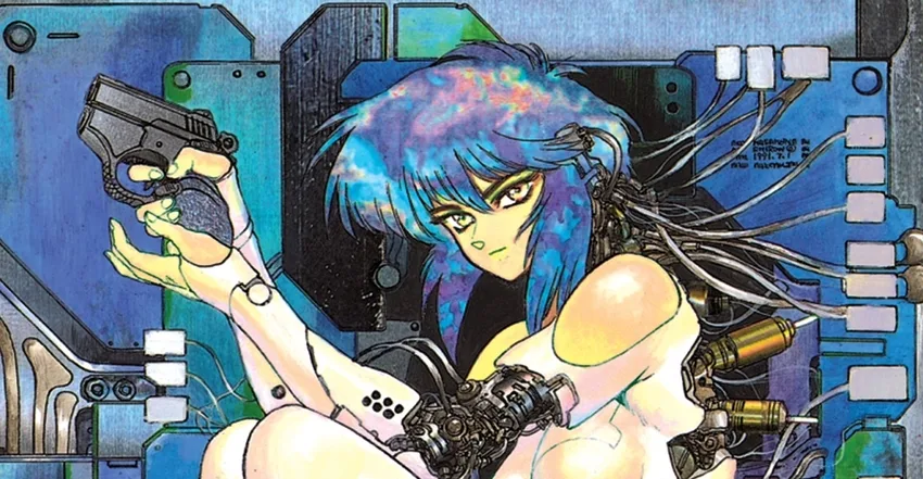
Trying to read a comic book page can feel overwhelming when you’re a new reader. Some pages are littered with panels and word balloons, making it hard for the inexperienced to figure out where the eye should look next. For some, it could be enough that they decide not to bother with comics at all. However, as you’ll soon find out, reading a comic book page doesn’t have to be a daunting task.
This guide shows you how to read a comic book page. My approach won’t be as academic as Scott McCloud’s seminal Understanding Comics, but it will cover the basics to get you started from a reader’s perspective. This includes understanding how to read the layout of a comic book page, what order you should read the contents of a panel, actionable advice for different scenarios, and heaps more.
By the end of this guide, you’ll be able to enjoy all the terrific stories that the comic book medium has to offer without any confusion. Enjoy!
Disclaimer: Unless specified, I will discuss how to read a comic book page through the lens of English-language comics, which read left to right.
Basic lingo
I will use some comic book lingo throughout this guide. So, before going too deep, it’s best that I explain some of it. I’ve pulled a few terms from How To Love Comics’ Glossary of Comic Book Terms that will come in handy for this guide.
- Panel – A panel is one of the boxes on the page of a comic book.
- Two-page spread – When the comic book art spills over into two pages.
- Word balloon – The (mostly) rounded balloons that portray dialogue in a comic
The mechanics of a page layout
Let’s begin with the page layout and its mechanics. This is how the panels are laid out on a page to tell the desired story.
You will likely read English-language-origin comics from left to right, just like you would a novel or webpage. Your eyes start in the top-left corner and move towards the right until they reach the edge of the page. They then follow the next row of panels below, beginning on the left-hand side again, and repeating until you reach the bottom right corner of the page. As a result, your eye makes Z-shaped patterns as it moves across the page. Don’t worry if you can’t imagine that. I’ll have plenty of visual aids to illustrate what I mean.
Let’s start off with something simple – a three-panel strip. In this example, you start at the leftmost panel and work your way to the right.
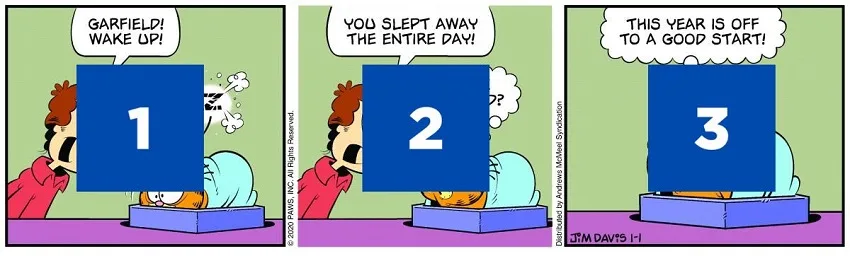
And this is the movement, from a panel-level, of how your eyes move across the strip.
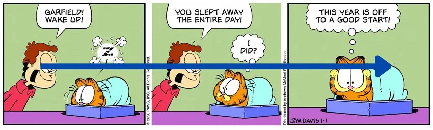
Using the same principles, let’s try a four panel page now. This time, there’s a second level to work with where the eyes need to not only go left to right but also down the page.
In this instance, the eyes make a Z-shaped movement through the page, as seen below.

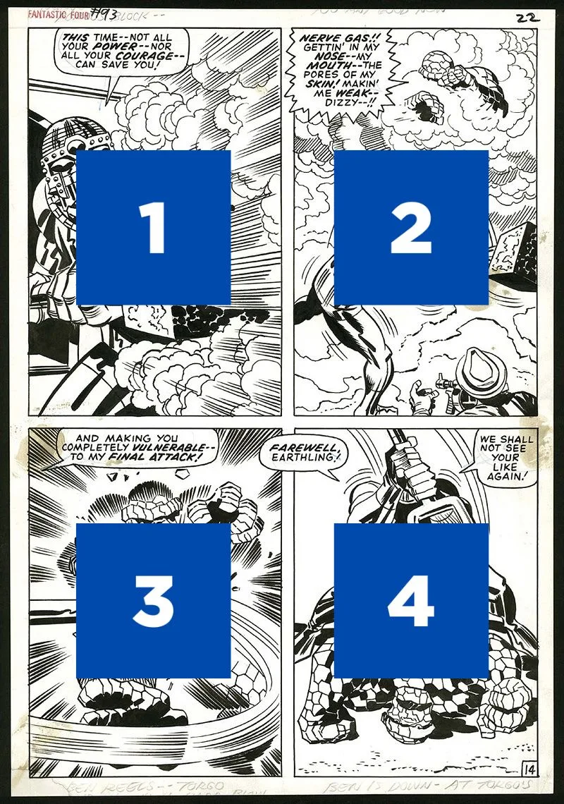
Comic pages can have the same number of panels on a page but laid out in different configurations. Here’s another four-panel page to illustrate.
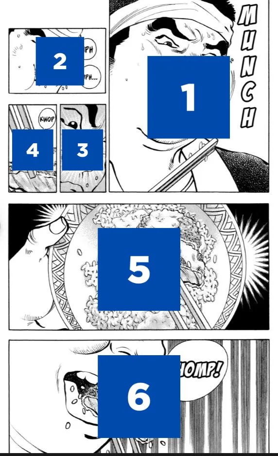
The same principles still apply if there are more panels on a page. In this example from Watchmen we have a nine-panel page.

In this instance, the Z-shaped movement of the eyes still applies but is done over three rows. You’ll find that your eyes will move more when the page has a higher density of panels.
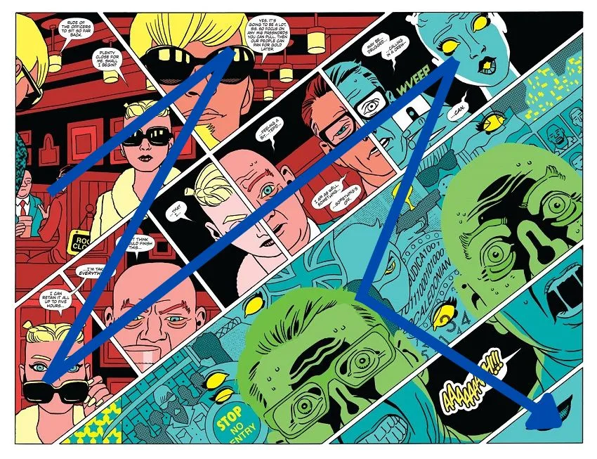
It’s worth noting that not all pages follow a grid-like structure. This Ninjak two-page spread by Javier Pulido is a more inventive example, working diagonally, but the principles of the above examples still apply.
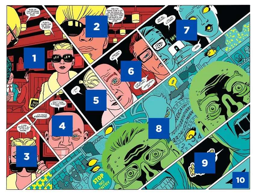
Your eyes still follow a Z-shaped manner like a traditional comic book page. The only difference is that it’s spread over two pages at a 45-degree angle.
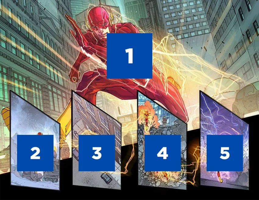
Speaking of two-page spreads, let’s quickly discuss those. There are two kinds of them. There are the ones that use the two pages to extend a single image over two pages. This is usually for big establishing shots or to show off something flashy. The other kind of two-page spreads are the ones that are like extended pages, with panel layouts spilling over the side-by-side pages.
While comic pages have different layouts with countless configurations, the rule of thumb applies 99.9% of the time – start reading left to right and move down towards the bottom of the page. The majority of published comic book artists follow these rules. As a result, almost all comic book pages you encounter will be straightforward enough to decipher which panel you should read next.
However, there are some unconventional pages out there. These are usually done by artists with a more experimental mindset, where the left-to-right, top-to-bottom approach is subverted. These are few and far between. However, you might come across them at some stage. An artist like J.H Williams III comes to mind. In these instances, there are usually contextual clues or they’re drawn in a way that pushes your eyes through a specific path.
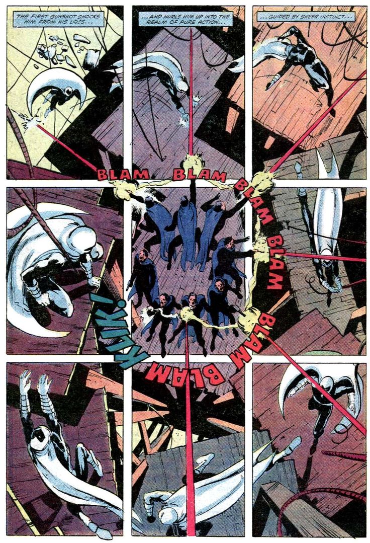
This Moon Knight page is a classic example. While it uses a 9-panel, it’s used uniquely. Artist Bill Sienkiewicz can break the rules as Moon Knight’s movement pushes the reader’s eyes in the desired direction.
Wait! What about manga? Comics originating from Japan are read right-to-left. As a result, you’ll want to flip some of the above advice. You can see an example of this below.
Before moving on to the contents of a panel, it’s worth noting that deciphering a comic book page will become second nature after you’ve read a few comics. This will happen naturally over time if they are well-crafted comics – in an almost invisible manner – if they prioritise clear storytelling over trying to look cool.
Inside the panels
We’ve talked about how to read a comic book page on a page layout level. Now it’s time to go more granular and talk about reading the contents of a panel, navigating the dialogue and other elements.
Each panel is unique, serving a storytelling purpose. As a result, I won’t be able to go through every possible variation. However, I can go through some concepts that can apply to most panels you will approach.
Again, let’s start simple and work on more elements over time. To begin with, a panel that’s simply an image. No dialogue, captions, or other elements are present – just a panel capturing a moment in time.
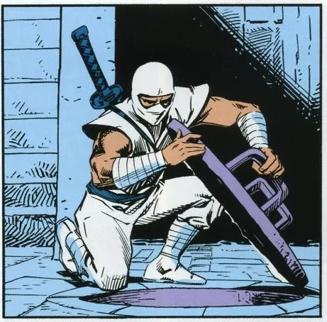
The above panel captures a single subject. In this case, the G.I. Joe character Storm Shadow opening a hatch. It’s a central image, so the reader doesn’t have to move their eyes all that much. Some may take it in all at once. For others, there might be some slight movement, where they will see Storm Shadow first, followed by the hatch, and, finally, the hole in the floor. Slight movements, but they’re composed to relay stages of information.
Each comic book panel will have varying degrees of eye movement for the reader. Some will be relatively stable, while others move your eyes down different paths to follow an action. Much of it comes down to what is happening in the panel and what the creators want to communicate.
Let’s introduce another element now – a caption box.
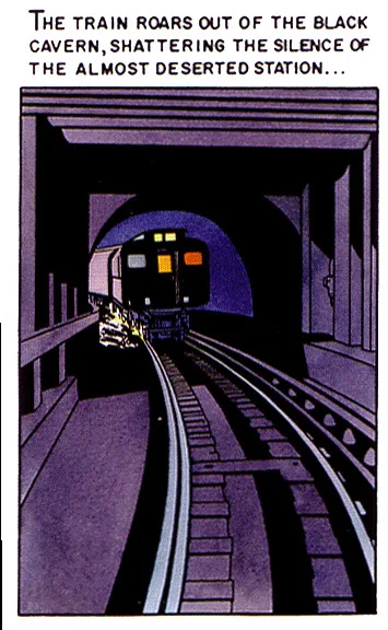
In this example, you read the caption box and then move your eyes down to the image. This is because the caption sets up the accompanying pictorial element. However, this can be reversed if the caption box is positioned below. Captions can also be inset into panels, floating on top of the art like a word balloon. I’ll explain how to treat those when I discuss dialogue in a moment.
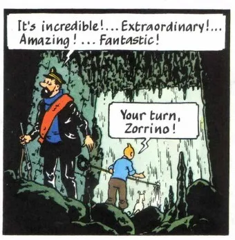
Let’s add a different element into the mix – a word balloon. This example from Tintin looks similar to the previous image, with a text-based element up top.
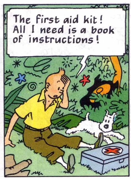
How someone approaches this panel will vary. Some may look at the pictorial element first, then read the word balloon’s text, while others may do the opposite. It doesn’t really matter which one you approach first. Your approach will probably depends on how your brain is wired.
What may also influence which element you look at first in a panel is how it fits in the context of the overall page. The previous panel on the page may force your eyes in a specific direction, leading you to a certain element in the next panel. This is often an intentional choice by the artist or letterer to help the story flow better or to control the pacing of events on the page.
What if there are multiple world balloons in a panel?
The rule of thumb is left-to-right and top-to-bottom, just like you would for the page layout. In the example above, you’d read Captain Haddock’s dialogue first, as it’s at the top of the panel, and then Tintin’s.
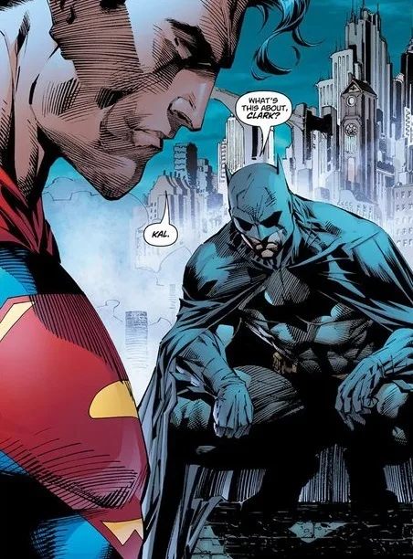
However, there are times where the first word balloon you read is not on the left. In the below example, you read Batman’s dialogue before Superman’s. This is one of those instances where a word balloon positioned higher in the panel is the one that’s prioritised.
Here’s a more chatty example from Ultimate Spider-Man.
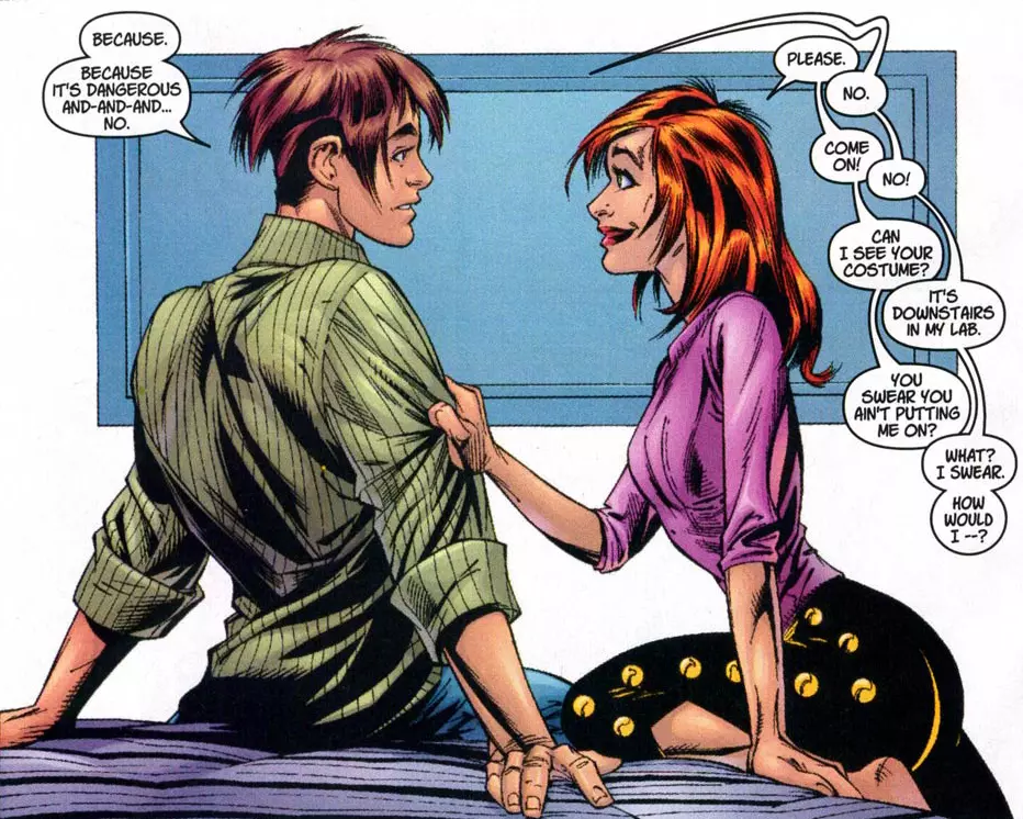
In the above example, you begin with the dialogue on the left, then move to the string on the right. Follow the path of word balloons down the panel, going back and forth with the characters’ exchanges.
What about caption boxes, thought balloons, and other elements like that? Treat those the same as you would word balloons. Left to right, and top to bottom. A good letter will place these on the page in a way that allows for a logical flow.
The above advice will cover 99.99% of the comics you encounter. On the rare occasion, you’ll come across a panel where it’s ambiguous as to what elements you should read first or perhaps the word balloon is not placed well. This sometimes happens with young creators still starting out or on titles with little or no editorial oversight. The best thing you can do in this situation is try to decipher the panel through the context of the dialogue. Does it make sense for the character to say something before the other?
Key takeaways for reading a comic page
A comic book page can appear confusing at first glance. However, you won’t have any issues if you remember these simple rules:
- Read the page left to right, starting from the top and making your way down the page.
- Each page will have a different configuration of panels, but the principle remains.
- On rare occasions, a page can break the above rules. However, it can only do this if the artist has illustrated it in a way that guides the readers through the page in a logical manner.
- What you look at first inside the panel will depend on how it’s composed. You might look at the pictorial element first, followed by dialogue/caption boxes/etc, or vice versa. An artist or letterer may craft a panel or page to instinctively move the reader’s eyes down a particular path. Other times, it might be left up to the reader.
- The rule of thumb when reading dialogue is to read the word balloon/caption box/thought bubble/etc situated in the top left first. Afterwards, move towards the right and head down the page.
- If in doubt, prioritize based on the context of the page.
Have your say
Did you find this guide useful? Share your thoughts in the comments below or via Facebook, X (formally Twitter), or Mastodon. You can also subscribe to the How To Love Comics newsletter.


Leave a comment