
While you shouldn’t judge a book by its cover, it doesn’t mean that you can’t admire it. Each month I find what I believe are the best comic covers of the month. This month there are an interesting mix of styles and publishers – with Image, Marvel, DC, Dark Horse and IDW all represented.

Deadly Class #1 Wesley Craig
There are a handful of elements that make Deadly Class #1 a great cover. The first of them being the minimal colours. Through the use of black, white and two different shades of blue, this colour sets a tone of a story that is on the grim side. The lighter blue also works well to contrast the characters, allowing them to stand out. The poses and clothing of each character also works well in this cover as it allows the viewer to make assumptions about each character as to who they may be. It also helps to make each character look unique, with more dimensions.

Shaolin Cowboy #4 by Geof Darrow
Geof Darrow is one of those artists that always seems to amaze and the cover to Shaolin Cowboy #4 is no exception. Consisting of a wide shot of the Shaolin Cowboy fighting zombies, this cover is hyper detailed. Every rock, wrinkle and detail (no matter how small) is rendered using super fine lines. Not only does it make the cover look more busy but also more lived in, while still catering to Darrow’s signature style.
The subject matter is also very cool. How often do you see a cowboy fighting zombies, and winning, with his bare hands?

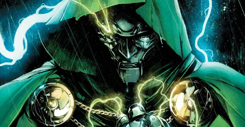
New Avengers #13 (Variant) by Mike Deodato
This cover is great as it shows off Black Bolt’s immense power well. This is portrayed through the use of thick line and the distorted radar-like circles. The shattering “New Avengers” logo is a nice touch that works well in the context of this character.

Savage Wolverine #14.NOW (Variant) by Phil Noto
Phil Noto’s variant cover for Savage Wolverine #14.NOW looks like it could be a cover that has been torn off a pulp novel. His image of Wolverine as a bootlegger in the 1930’s looks great, especially with the Tommy Gun in one hand and his claws out in the other. The logo and the text contribute to the pulp vibe and are really the icing on the cake.

All-Star Western #27 by Giuseppe Camuncoli
All-Star Western #27 is a great post-action scene. The angle used accentuates Superman’s power by showing him levitating. The angle also allows for the ground, littered with shells, to be shown and helps tell a story and tease what is to come in the issue. Superman’s cape and Jonah Hex’s jacket flapping in the wind is also a nice touch and gives the cover an extra aspect to be visually interesting.

Godzilla: Rulers of Earth #8 by Matt Frank
You would almost say that this cover is family portrait, although with giant monsters. While this may sound silly, I believe it works as it harks back to the more silly manner of the 60’s films. Each monster looks great with plenty of detail from their scales, bumps and hairs. The use of the classic Godzilla cry, “SKREEONK!”, is a great addition and it is almost like he is saying “cheese.”

Teenage Mutant Ninja Turtles #30 (Cover A) by Ross Campbell
This is an intimate cover that excels from empty space in the background. Ross Campbell’s colouring looks great, especially when it comes to the tree stump that used colour to add detail to it. The falling leaves are a nice addition to the cover.
What Was Your Favourite Cover?
What are your favourite comic covers from January 2014? Let us know on Facebook, Twitter or in the comments below.
Leave a comment