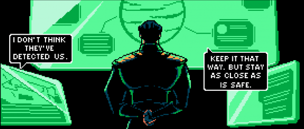
Published by Slave Labor Graphics, Nova Phase is an upcoming science-fiction/western written by Matthew Ritter and art by Adam Elbatimy. Nova Phase is a unique comic due to its art style, which is entirely in 8-bit. I had a chat with both Matthew Ritter and Adam Elbatimy about the comic, especially about their influences, how the project came to be and the interesting choice of using 8-bit graphics for art.

Q: How did the idea of Nova Phase come about?
Adam: Matt and I have worked together in the past, and when he approached me to do a comic using 8-bit, NES style art, I thought it could be a great way to combine my two big artistic interests, comics and pixel art. We actually tossed a few different ideas for the story back and forth, but the scifi/western hybrid that Matt had come up with ended up sticking. He sent me some ideas for characters, which I turned into sketches, and soon enough we had a script and a world growing up around it!
Matthew: That’s about it. Though, I remember Adam having more to do with the setting then just approving my idea. I think someone mentioned Outlaw Star, or maybe Cowboy Bebop. Something like that. I think it might have even been him. Some character ideas got tossed back and forth, I did a pixel mock-up (nothing like Adam’s, he’s a genius, and I am but an amateur) he made some great sketches, I threw out some theme ideas, Adam approved, and then I did a quick short script. Adam liked it, and we ran from there. He’s definitely given much more to this project than just art though, tone, style, suggestions. Really, I could never have done this if I hadn’t ran into such a talented pixel artist who can also be counted on to meet deadlines.
Q: Nova Phase seems to take influence from a lot of media, both Western and Japanese. What media would you say influenced Nova Phase, both in narrative and art direction?
Adam: From an art perspective, the biggest influence would probably be actual games from the late eighties, like Ninja Gaiden from Tecmo and Snatcher from Konami, that tried to be really cinematic despite the hardware limitations. I’m a big fan of Mike Mignola’s Hellboy books, and I think the use of heavy shadows against super saturated colors in Nova Phase probably has some roots there. Scifi manga like Yasuhiro Nightow’s Trigun influenced alot of the designs, whether it was clothes or more technical stuff like weapons and ships.
Matthew: So many. So many. So. So. So many. I could list names and comics and books and movies, no one but me has probably ever heard of. Everything we do is a product of everything we’ve done, and experienced. So it’s hard. I’d be lying if I said that obvious things like Cowboy Bebop, Outlaw Star, Farscape, and Firefly weren’t thought of at times. Yet, at the same time, I’m often playing Zaxxon while writing. Or watching old samurai films like Yojimbo. Old western TV shows like the Rifleman, looking at comics that manage to do interesting things like Scott Pilgrim or Savage Sword of Connan, I’m just all over the place.

Q: Does having 8-bit art create a challenge in any way? Also, does it change the creative process?
Adam: There are definitely unique challenges involved. When I plan out pages, sometimes the shots I have planned don’t read very well in the low resolution style due to the lack of detail, and have to be drastically changed. Also, it can be tough to select appropriate colors when working with such a limited palette. I have to be very careful about that. Sometimes I’ll design a character on paper, just to find out that the color scheme I had in mind doesn’t work at all.
Matthew: We have run into some issues. Such as dialog. The style makes it so that words take up a lot of space. Something that seems like it isn’t that much dialog in the script might be twice as much as can actually be supported on the page. Adam does a great job doing his best to make it fit, and occasionally doing edits himself. I’ve never found any real issue with his edits. I think he does an amazing job, especially as I do the script Screenplay style, so he’s the one deciding the panel layout. Normally, the script is written with the writer describing each panel, so the artist knows just what they want, we work in a way that gives Adam more freedom. Though, I’m sure it must be frustrating sometimes too.
Q: In issue #1 the reader is introduced to Veronica Darkwater. She seems to be a person with big ambitions, but at the same time has personal code as to how she will reach those ambitions. Will her moral code be tested throughout the narrative?
Adam: I don’t know if tested is the right word… she definitely is exposed to other ways of doing things, and I think that she maybe starts to question her methods and values a little. It is a tough pill to swallow when you find yourself respecting someone whose ethics don’t quite match up with your own, and Veronica has this great kind of toughness touched with vulnerability that makes her that much more susceptible to self doubt.
Matthew: A character should always be ‘tested’, though as Adam said, maybe that’s not the right word. The character at the start of a story, is hopefully different from the character at the end, because then we know the story had meaning. At least to that character. Veronica will not be the same person by the end of the story that she is at the beginning, for better or for worse.
Q: Throughout the narrative the reader is introduced more concepts and characters that allows for the world to get larger. What is it like creating a world such as the one in Nova Phase, especially when combining Western and Science Fiction elements?
Adam: For me, a lot of that expansion comes from the little details I can get into the scenes. The look of the skyline, or the other patrons of the bar, can do alot to fill out the world of the comic and give the suggestion of what else could be. A little like Star Wars, I think, where you’ve got all these interesting characters and places that you only really see at a glance.
Matthew: I really hope I just keep it all straight. I think a world should be consistent. If a reference is made that something works like this or that, I want it to work like that later. Also, I want a world to at least be internally consistent, so that it’s easier to believe. It doesn’t need to follow all the rules of our world, but it should follow its own rules steadily. Though, it’s always nice to hear specifics of a universe and get a feel for the larger scope of the world around the characters.

Q: Nova Phase has a unique release schedule. Can you go into some detail of how Nova Phase will be released?
Matthew: Assuming all goes well, the release should go like this. Issue 1-2, released digitally on January 15th. First issue is free, second issue 99c. Then, the month after that, issue 1-2 will be released in print form. In march, issue 3 should be released, digitally, and in April, issue 4. Then, in June, issue 3-4 in print form… and so on. It could be subject to change, but that’s what the publisher wants to do.
Q: A two-track soundtrack will accompany Nova Phase, which is an interesting concept for a comic. How did this come about?
Adam: That I have to say was entirely Matt’s doing. From the beginning, he has been really picturing the 8-bit game this comic could have been, and I think the soundtrack idea was probably an extension of that. Hearing that kind of chip tune music along with this very nostalgic art I think completes the illusion that this really is some kind of lost NES game.
Matthew: I have worked with the artist who did the bit tunes before. He’s amazing talented. Amazingly so, and I love bit tunes, so I had to ask if he’d be interested. Also, music is cool. So ya know. Really, it’s just one of those vanity things, who doesn’t want to hear music based on their world? I go over and listen to it all the time, the two songs are often on loop when I’m writing: https://www.14hoursproductions.com/bittunes/ if anyone else wants to listen. They’re super cool!
Nova Phase #1 and #2 are available on Comixology from January 15th. You can keep up with all the Nova Phase news here.
Leave a comment