
While you shouldn’t judge a book by its cover it doesn’t mean that you can’t admire it. Each month I find what I believe are the best comic covers. In August’s batch of comic covers is a real mix bag, with many different styles, publishers and genres of comics, but all of them great.
View previous Best Comic Book Covers of the Month

Sheltered #2 by Johnnie Christmas
Not only is Johnnie Christmas a pretty cool name this is a pretty cool comic book cover. The way the character’s hair becomes flames and skeletons works really well and sets a tone for the issue. Christmas has created a very emotive face through his use of line and shadow that makes you want to know more about this character.
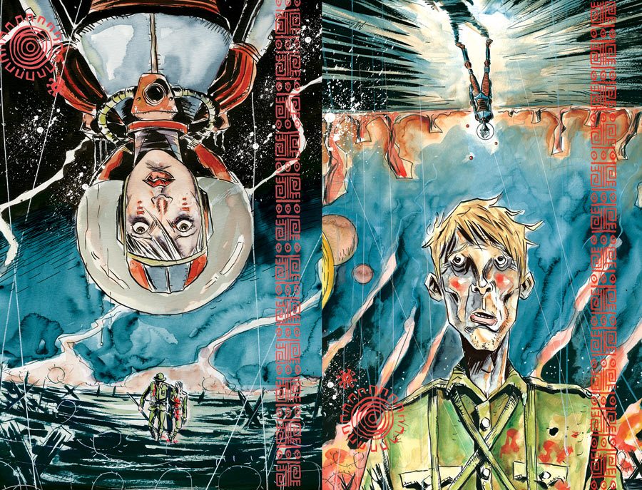
Trilluim #1 by Jeff Lemire
Not content with one cover Trillium was a flip-book with two covers that thematically connected. The flip-book idea is a great one as it shows each character at two very different ends of time. Jeff Lemiere’s water coloured style is unique and shows plenty of emotion and detail on both faces. The scenery, while sparse, is still detailed thanks to the inking and water colours and sets the tone well.

Kill Shakespeare: The Tides of Blood #5 by Simon Davis
What makes this cover great is the shock value of it, It is a bloody head coming out of a book. The white background contrasts meaning that the main image does all the talking. The image its self is detailed and the face shows a great deal of pain.

Uncanny X-Men #11 by Phil Noto
Instead of a cover that is a pose we get a point of view shot from a sentinel. I have always enjoyed Phil Noto’s as his facial expressions are generally spot on. The costumes look great and look like they are real clothing through the ruffles and lighting effects. The use of the sentinel’s interface is clever and is portrayed well through colour, line, text and even the monitor’s texture.

Astonishing X-Men #65 by Phil Noto
You can’t talk about Phil Noto without talking about his Astonishing X-Men #65 cover also. Iceman looks fantastic through the fantastic angel-like wings and and the way Phil Noto has been able to render the way light hits the ice. A frozen Mjölnir (Thor’s hammer) falling is another nice touch and it helps portray Thor’s struggle.

The Activity #14 by Mitch Gerads
The point of view aspect of this cover shows that a character is sinking quite well. The addition of a hand reaching out portrays the struggle effectively and helps tell a story. The use of the helicopters shows that there is combat happening at the time and contributes tot he story the cover is trying to tell. I like the silhouette of the gun as it is an effective separator and which gives some more blank space below. This allows the title to be place below and not obstruct the imagery above.

The Shadow #16 by Alex Ross
The Shadow #16 is a cover where you are thrown straight into the action. The angle the cover is positioned makes it feel like you could be observing what is going on. It also allows for the spot light to be shown effectively and the urgency through the number of policemen/guards. It goes without saying that Alex Ross can paint a fantastic cover with attention to detail in all areas.

Judge Dredd #10 Retail Incentive Cover by James Biggie
The propaganda aspect of this cover is great. If I were in Mega City One I would be scared of Judge Dredd, especially if I were a criminal. The way the helmet is shown makes it look like Dredd is constantly watching, while the blood shows that he means business.

Wonder Woman #23 by Cliff Chiang
My favourite part of the cover is how detailed and wild the tentacle-like beard is. Wonder Woman’s pose shows that she means business and portrays how strong of a character she is. The colours are vibrant and are distinctively Cliff Chiang.
Have Your Say
Do you have a favourite comic book cover from August 2013? Let me know on Facebook, Twitter, Google+, or in the comments below.
Leave a comment