While you shouldn’t judge a book by its cover it doesn’t mean that you can’t admire it. Each month I find what I believe are the best comic covers. This months batch of comic covers is a real mix bag, with many different styles, publishers and genres of comics.

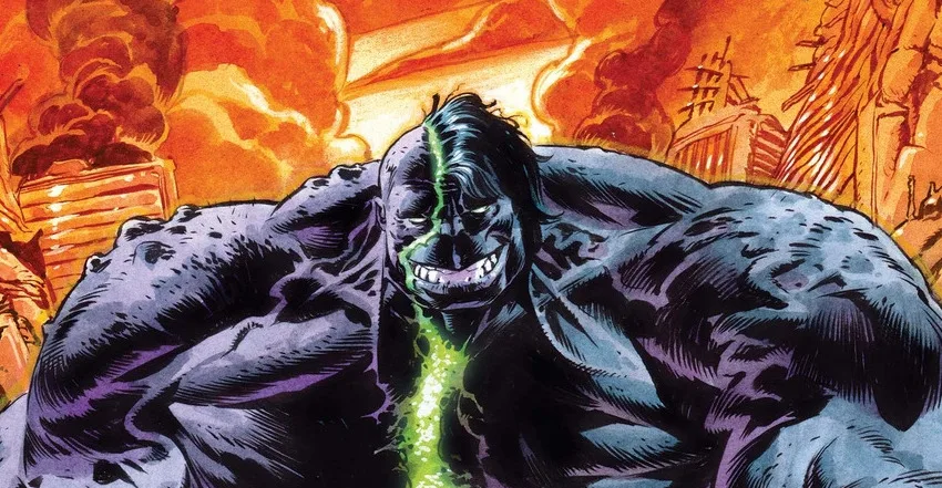
Gamma (one-shot) by Ulises Farinas
I used to draw crazy monsters everyday for a creative blogging project and I know how hard it can be to create all kinds of unique characters. It is a difficult task to create a character that hasn’t been done before but Ulises Farinas has managed to do it on the cover of Gamma. All these creatures are so varied and every time you look at the cover you discover a new character that you hadn’t noticed before.

Daredevil: Dark Nights #2 by Lee Weeks
This comic cover plays homage while still reflecting the narrative that is going on in this mini series at the moment. The show and darkness behind it shows a great sense of isolation which match the street signs that all seem to go against Daredevil.

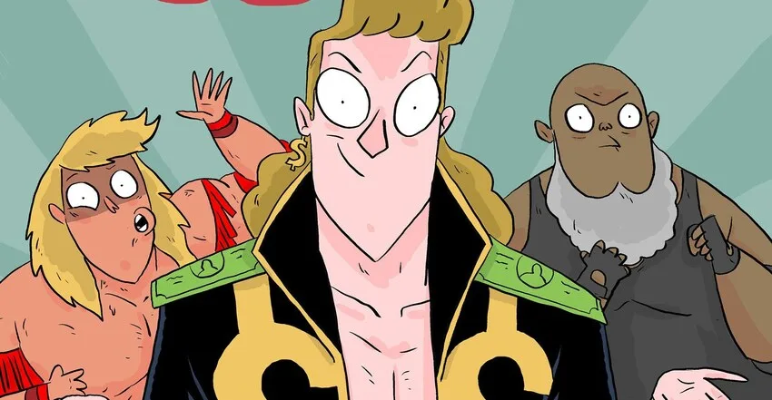
Ehmm Theory #2 by Larkin Ford
While I know next to nothing about this particular series from Action Labs, it is a fun cover. My favourite part of this cover would definitely have to be the little cat hanging off the giant cyborg crab claw. it’s expression, while showing fear, is still quite cute.

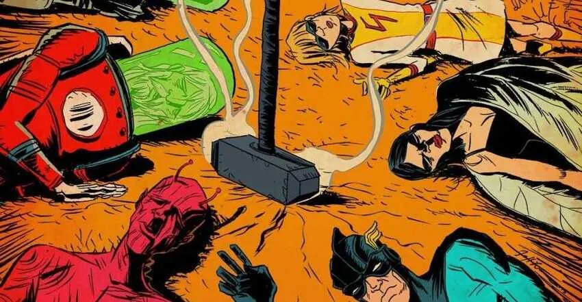
Archer & Armstrong #11 by Pere Perez
Archer & Armstrong #11 plays homage to the end of the opening sequence of the Brady Bunch, utilising the odd cast of characters in its place. The expressions on the character’s faces gives it an extra bit of fun, especially when the dinosaur becomes the centre of attention.

The Superior Foes of Spider-Man #1 by Marcos Martin
I really enjoy the way the title is incorporated into the shadow, making it feel more natural as opposed to photoshoped in later on. Marcos Martin’s style is great and has a silver age feel while still being modern.

Godzilla #13 by Bob Eggleton
This cover was so big it needed the back and the front to fit everything in. The amount of detail on Godzilla is crazy and the painted-style really fits with the tone of the classic movie posters.

Garfield #15 by Gary Barker
I have always been used to seeing Garfield in the Jim Davis style so it is nice to see that someone else can successfully put their own style to the character. Gary Barker has been able to give us something different while still giving us the Garfield we all know and love.

Genius by Teddy Kristiansen
The most interesting thing about the OGN cover is the design aspect of it. The title takes up the majority of the cover but you still have elements that hint to the narrative in the foreground and background.

Revival #12 by Skottie Young
Skottie Young is known for his recent Marvel variant covers featuring characters as small children. He has taken that style and applied it to Revival #12 and has done so with great success. What make this cover a bit different to all the other is that the central image only takes up a 3rd of the cover. This means that, even though there is plenty of white space, the publisher requirements (like barcode, the price and the Image logo) and the title do not obstruct the image in anyway. It also helps that the image is very fun and will easily put a smile on your face.

Batman: The Dark Knight #22 by Alex Maleev

All the elements tied up together make this cover great. The target practice board mixed with the Batman imagery really makes the cover stand out, with the blood splatter giving the cover a bit more urgency.
The Flash #22 by Francis Manapul
What I enjoy about this cover is the way the Reverse Flash has been used in the shadow. It portrays him well as he is like the Flash in many ways but evil. The limited colour pallet works well to portray all the elements needed in the cover.
Leave a comment